I've come to believe that my approach to constructed languages is a little different from most conlangers. It seems to me that most people first fall in love with the phonology or diachronics of a natural language (or a family of natural languages), and spend as much time as possible fixating on sounds: for the unadventurous, 'build-your-own-Romance-language' is an entire genre, and will probably be the only way they'll arrive at something that can be used to write more than a few words. Beyond that, xenophilia is an overriding obsession: for phonologies that aren't nearly identical to English, [ɕ] is more common than [ɹ]. Maybe this is all just an artefact of how linguistics is taught in the average university curriculum, but it's always struck me as odd that so many conlangers immediately make a bee-line for the parts of the art that are the least creative. (And if a conlang does make it past the first post and get into some vocabulary, there's a good chance it'll have triconsonantal verb roots, which have become, for lack of a better term, a meme.) To avoid drawing out this too much, my favourite topics are more in the areas of glyphs and words. I'd rather see a dictionary with a nice alphabet chart than a complete set of sound changes and grammar. (Although grammar is, I suppose, neutral ground. It's pretty cool too.)
Anyway. With that venting done, let's talk about your conscript and why it's probably garbage.
#1: You let Tengwar influence you.

(Or someone in your neighbourhood glanced briefly at a poster featuring an image of the One Ring and their thoughts infected you via miasma theory.) Tengwar is the pinnacle of hostile writing system design, as a full two thirds of its consonant inventory rigidly adheres to a systematic featural system dominated by repetition along the mid-line. It should, honestly, be used as a tool to teach what it's like to be dyslexic.
While in the past, we believed a word's general outline, called its Bouma, was the most important criterion used to read text quickly, it turns out that being able to see the middle of letters is what really matters. "nusnına" looks a lot more like "hushing" than "buebiny" does. If this weren't true, fonts with large x-heights wouldn't be easier on the eyes than those that use the same vertical space for ascenders and descenders: Times New Roman vs. Garamond being the proverbial pair of examples. But it's not that way. Not even slightly. And Tolkien's brilliant linguistic work is undermined by this synthetic and unnatural script.
#2: You let Old Slavic or Coptic influence you.

Here's a fun fact you can't share at parties: the Cyrillic letters ш, щ, ц, and ч derive from , a hieroglyph that Gardiner calls 'pool with lotus.'
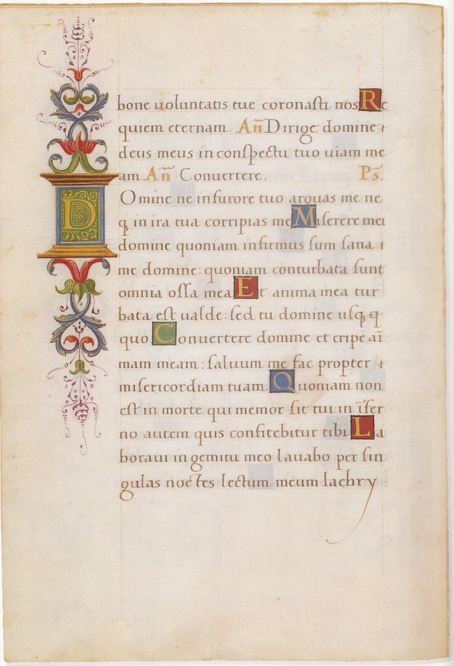
In the middle ages, written language was created and consumed primarily by people we would consider barely literate today. The Byzantine text-type is perhaps the most egregious proof of this; fashionable in the later period of Constantinople, it was exported as the liturgical script of Orthodoxy, and served primarily as an instrument of terror, a little like how Rome kept exporting Popes. This was the era when ligatures were invented and employed not to save space or time in writing, but rather to avoid wasting paper whenever the scribe made a mistake.
Coptic, Byzantine, Alexandrian, and Old Slavic are the Eastern equivalent of Blackletter (Textura) hands. They are not true blackletter scripts as they lack the signature, regularized feature of drawing the tops and bottoms of the letter 'o' as a pair of inverted arches. (This is the origin of the name 'Fraktur,' i.e., fractured, which contrasts with 'rotunda' or 'antiqua' for everything else.) Fortunately, these scripts are rarely attempted by conlangers. But aside from their horrifically bad horizontal/vertical contrast ratios, their mere existence can inspire a lax grasp on consistency. It's easy to look at letters like Ж, Ѭ, ѩ, and Ѯ, and to take them as permission to totally disregard any pesky lessons one may have learned about the acceptable number of strokes per phoneme. Don't do this! Try to forget these scripts ever existed! Good writing systems need to have generally consistent and especially low stroke counts for each glyph. If you want to acquire a Greek aesthetic on the cheap, look to a later era: Renaissance-era minuscules have legitimately beautiful ligatures that were commonplace in all Greek-language typesetting until the 19th century.
#3: You let Canadian Aboriginal Syllabics influence you.

At first blush, CAS seems like it should be an amazing example of how featural systems should work. It's systematic, makes creative use of glyph orientation, and has a geometric primitiveness that evokes the serene stillness of an inuksuk on a windswept Arctic plain.
Then you read into it more and discover that the original system used bold type to distinguish vowel quantity. What the...
CAS owes much of its personality to Pitman shorthand and related tachygraphic scripts, which it strongly, visually resembles. Counting all of the orientations of its symbols, it ends up using 96 distinct glyphs to represent an inventory of 21 phonemes. This would be acceptable but for two reasons:
1. It kills the smooth ductus of Pitman. This is also why Pigpen is bad; < and > fight each other in terms of stroke direction. Japanese Hiragana may take more time to learn, but it's faster and easier to write with the same information density. (Katakana is another story.)
2. It makes some inscriptions (actually, any inscription without terminals or the newer pointing system) unorientable. This is hostile to dyslexics, and means that objects that frequently get rotated, like coins, can potentially have ambiguous readings. If you dig up a plaque with a CAS inscription in an unknown language, you may have two phonosyntactically valid transliterations and no way to disambiguate them. This is less of a problem for Pigpen because the vowels are distributed unevenly, but it's certainly possible to contrive short words with ambigrammic readings, e.g. 'BIB' and 'HAH'.
I would think very carefully before letting the aesthetics of this writing system influence you. Its visual design might suggest something pristine and unburdened by European history (much like Futura and Helvetica were seen as international and culturally neutral fonts in the mid-twentieth century), but rather than being the product of an often-oppressed indigenous culture reaching into its roots to shape its identity, it's more along the lines of the noble savage trope: designed by a white missionary, and used to paint dozens of distinct language groups with a singular, uniform brush. Look to this script if you want to see how cultural outsiders would invent a writing system.
This seems to happen with North American languages a lot, actually. The Cherokee syllabary has the distinction of being invented by an actual First Nations man, but its design is based on appropriation, effecting the style of the Latin alphabet without any real connection to it. Guess how many conlangers have committed this sin of shallow imitation? (Answer: all of us.) Sequoyah deserves high praise for being one of the first neographers, but we have the benefit of hindsight, and the only people who should be repeating these mistakes are fictionalized versions of Sequoyah.
For good starting material, I think the best approach would actually be to investigate various cases where proto-writing was independently invented, such as Rongorongo, Nsibidi, the Vinča symbols, and (possibly) the deeply perplexing Phaistos disc. These examples capture the gradual transition from pictogram to mnemonic to phoneto-semantic encoding, and retracing this development trajectory for your own script is the best way to credibly invent writing from scratch.
#4: You wanted your own Hangul.

The Korean writing system is great. A lot of people think so, many of who aren't Koreans or even literate in the language. This is called Hangul Supremacy or Hangul Exceptionalism. There's literally a term for it, which Wikipedia feels earns it a place in an categorical infobox just a few lines above anthropocentism, along with a variety of national exceptionalisms that are somewhat broader than a writing system. That's how strongly people feel about it.
It's very hard to imitate Hangul's syllable construction methods without the reader instantly noticing, and a part of that reader will die inside when they realise you only copied the syllable structure, not the featural letters. The glyph construction methods are even more exquisitely singular; it's hard to even riff on how the vowels are designed since they include basic single straight lines and just about every variation on a T imaginable. If you want to do something interesting with Hangul, try working on Korean spelling reform. It's not actually a perfect phonetic transcription.
Overly obvious syllable construction methods aren't unique to Hangul imitators. Abugidas and abjads with obligatory pointing, like some modes of Tengwar and modern Hebrew, can look like they have a çášë öf hêávÿ mêtàł þøïšõñíñg. Don't overdo it with the spices. The Black Speech didn't.
#5: You wanted to pursue extreme synthetic minimalism.
Everyone does this at least once: you're working on your first conlang font. You want it to be nice, professional, and regular-looking. You think you're getting a pretty good grasp on this newfangled vector graphics program thing, but admittedly it's still new to you. You're working on a letter that's a fusion of two other letters you've already designed, so you try to splice them together, and...


Oh no. Oh no. "What the hell is going on in the middle there? I lined them up correctly," you think. But you're feeling impatient, just want to get it done, and assume you made a mistake of some kind while working through your process of constructing modular components. But no: the letter S isn't made out of two semicircles glued together, and whenever you try to combine two circles, you'll end up with a very visible discontinuity in the first or second derivative.
Paul Renner must have encountered this very problem when designing Futura. His final design avoids it by blending the curves to look more natural, resulting in no discontinuities. Futura is one of the stereotype-defining geometric sans-serif fonts; it was Helvetica before Helvetica was Helvetica; it went to the moon and past the edge of the solar system. But it isn't exact.

Still, not everyone looks into the issue so closely when they encounter it.

The modern text-type of Mkhedruli, the secular Georgian script, is born of the marriage between this oversight and a generally weak grasp of how to hold a pen when writing a left-to-right language. To be fair to Mkhedruli, it didn't always look like shit, but there are still some seriously questionable things happening with some of those descenders, which I think are caused mostly by the spur on ს. (Look at the loop near the end of line 10. Which way was the pen going afterward?)
The difference between modern Mkhedruli and the original royal charter isn't just due to this tendency toward Ikea-tier glyph composition, however. Part of knowing how to hold a pen is in deciding when to press firmly and when to press lightly, which gives rise to stroke contrast, and the rookie mistake is in assuming the pen's nib is always held at a constant angle.

This is very easy to disprove by looking at a real font! In all Latin serif fonts, the diagonal stroke of a capital N is shaded, not the vertical strokes. Similarly, the Georgian royal charter is split almost evenly between heavy shading on horizontal and vertical strokes. This enhances the legibility of the script in a way that systematically thickening the letters along a fixed axis can't do.
The heart of this aesthetic catastrophe is in the mistaken belief that computer fonts are something from the Information Age and therefore not tied to ductus. After all—Helvetica doesn't look like anyone's handwriting. But Helvetica and all other fonts do depend on writing in a very specific way, which is that they're designed on the assumption that an instrument with certain properties is actually being used to write them. Serif fonts evolved from an actual formal text-type along the following path—


Jenson is on the cusp of real and imagined; most of the strokes are doable with a pen, like the Humanist script in the first picture, but some are just a little too refined to be real. Garamond is the first step beyond the real, but it still follows the rules of a pen-like instrument, just like cuneiform followed the rules of a reed stylus. This is how fonts retain a coherent visual identity despite being bundles of vector data in a computer; they're the result of stroking along a path with this sort of tool. In general, good body fonts will still adhere to a humanly-executable ductus, but some of the nuances about how to rotate the pen or draw ornaments (like serifs) might be challenging or impossible to execute consistently.
Bringing it back to the original letter-combining example: good-looking writing systems aren't just the result of synthesizing the results of a few rules. That's what causes the spur in the middle of the S, as well as the bad stroke contrast in Mkhedruli and the Byzantine text-type (see point #2). It is absolutely, positively necessary to inject some humanity into the letters as they depart from being abstract topographies of joints, lines and corners and become real forms that have weight and size on the page. Many typographers and calligraphers have independently discovered this fact, and your conworld will be better off if you know in advance the pitfalls of problematic designs.
This concludes 'Your Writing System Sucks.' For now.
Anyway. With that venting done, let's talk about your conscript and why it's probably garbage.
#1: You let Tengwar influence you.
(Or someone in your neighbourhood glanced briefly at a poster featuring an image of the One Ring and their thoughts infected you via miasma theory.) Tengwar is the pinnacle of hostile writing system design, as a full two thirds of its consonant inventory rigidly adheres to a systematic featural system dominated by repetition along the mid-line. It should, honestly, be used as a tool to teach what it's like to be dyslexic.
While in the past, we believed a word's general outline, called its Bouma, was the most important criterion used to read text quickly, it turns out that being able to see the middle of letters is what really matters. "nusnına" looks a lot more like "hushing" than "buebiny" does. If this weren't true, fonts with large x-heights wouldn't be easier on the eyes than those that use the same vertical space for ascenders and descenders: Times New Roman vs. Garamond being the proverbial pair of examples. But it's not that way. Not even slightly. And Tolkien's brilliant linguistic work is undermined by this synthetic and unnatural script.
#2: You let Old Slavic or Coptic influence you.
Here's a fun fact you can't share at parties: the Cyrillic letters ш, щ, ц, and ч derive from
, a hieroglyph that Gardiner calls 'pool with lotus.'In the middle ages, written language was created and consumed primarily by people we would consider barely literate today. The Byzantine text-type is perhaps the most egregious proof of this; fashionable in the later period of Constantinople, it was exported as the liturgical script of Orthodoxy, and served primarily as an instrument of terror, a little like how Rome kept exporting Popes. This was the era when ligatures were invented and employed not to save space or time in writing, but rather to avoid wasting paper whenever the scribe made a mistake.
Coptic, Byzantine, Alexandrian, and Old Slavic are the Eastern equivalent of Blackletter (Textura) hands. They are not true blackletter scripts as they lack the signature, regularized feature of drawing the tops and bottoms of the letter 'o' as a pair of inverted arches. (This is the origin of the name 'Fraktur,' i.e., fractured, which contrasts with 'rotunda' or 'antiqua' for everything else.) Fortunately, these scripts are rarely attempted by conlangers. But aside from their horrifically bad horizontal/vertical contrast ratios, their mere existence can inspire a lax grasp on consistency. It's easy to look at letters like Ж, Ѭ, ѩ, and Ѯ, and to take them as permission to totally disregard any pesky lessons one may have learned about the acceptable number of strokes per phoneme. Don't do this! Try to forget these scripts ever existed! Good writing systems need to have generally consistent and especially low stroke counts for each glyph. If you want to acquire a Greek aesthetic on the cheap, look to a later era: Renaissance-era minuscules have legitimately beautiful ligatures that were commonplace in all Greek-language typesetting until the 19th century.
#3: You let Canadian Aboriginal Syllabics influence you.
At first blush, CAS seems like it should be an amazing example of how featural systems should work. It's systematic, makes creative use of glyph orientation, and has a geometric primitiveness that evokes the serene stillness of an inuksuk on a windswept Arctic plain.
Then you read into it more and discover that the original system used bold type to distinguish vowel quantity. What the...
CAS owes much of its personality to Pitman shorthand and related tachygraphic scripts, which it strongly, visually resembles. Counting all of the orientations of its symbols, it ends up using 96 distinct glyphs to represent an inventory of 21 phonemes. This would be acceptable but for two reasons:
1. It kills the smooth ductus of Pitman. This is also why Pigpen is bad; < and > fight each other in terms of stroke direction. Japanese Hiragana may take more time to learn, but it's faster and easier to write with the same information density. (Katakana is another story.)
2. It makes some inscriptions (actually, any inscription without terminals or the newer pointing system) unorientable. This is hostile to dyslexics, and means that objects that frequently get rotated, like coins, can potentially have ambiguous readings. If you dig up a plaque with a CAS inscription in an unknown language, you may have two phonosyntactically valid transliterations and no way to disambiguate them. This is less of a problem for Pigpen because the vowels are distributed unevenly, but it's certainly possible to contrive short words with ambigrammic readings, e.g. 'BIB' and 'HAH'.
I would think very carefully before letting the aesthetics of this writing system influence you. Its visual design might suggest something pristine and unburdened by European history (much like Futura and Helvetica were seen as international and culturally neutral fonts in the mid-twentieth century), but rather than being the product of an often-oppressed indigenous culture reaching into its roots to shape its identity, it's more along the lines of the noble savage trope: designed by a white missionary, and used to paint dozens of distinct language groups with a singular, uniform brush. Look to this script if you want to see how cultural outsiders would invent a writing system.
This seems to happen with North American languages a lot, actually. The Cherokee syllabary has the distinction of being invented by an actual First Nations man, but its design is based on appropriation, effecting the style of the Latin alphabet without any real connection to it. Guess how many conlangers have committed this sin of shallow imitation? (Answer: all of us.) Sequoyah deserves high praise for being one of the first neographers, but we have the benefit of hindsight, and the only people who should be repeating these mistakes are fictionalized versions of Sequoyah.
For good starting material, I think the best approach would actually be to investigate various cases where proto-writing was independently invented, such as Rongorongo, Nsibidi, the Vinča symbols, and (possibly) the deeply perplexing Phaistos disc. These examples capture the gradual transition from pictogram to mnemonic to phoneto-semantic encoding, and retracing this development trajectory for your own script is the best way to credibly invent writing from scratch.
#4: You wanted your own Hangul.
The Korean writing system is great. A lot of people think so, many of who aren't Koreans or even literate in the language. This is called Hangul Supremacy or Hangul Exceptionalism. There's literally a term for it, which Wikipedia feels earns it a place in an categorical infobox just a few lines above anthropocentism, along with a variety of national exceptionalisms that are somewhat broader than a writing system. That's how strongly people feel about it.
It's very hard to imitate Hangul's syllable construction methods without the reader instantly noticing, and a part of that reader will die inside when they realise you only copied the syllable structure, not the featural letters. The glyph construction methods are even more exquisitely singular; it's hard to even riff on how the vowels are designed since they include basic single straight lines and just about every variation on a T imaginable. If you want to do something interesting with Hangul, try working on Korean spelling reform. It's not actually a perfect phonetic transcription.
Overly obvious syllable construction methods aren't unique to Hangul imitators. Abugidas and abjads with obligatory pointing, like some modes of Tengwar and modern Hebrew, can look like they have a çášë öf hêávÿ mêtàł þøïšõñíñg. Don't overdo it with the spices. The Black Speech didn't.
#5: You wanted to pursue extreme synthetic minimalism.
Everyone does this at least once: you're working on your first conlang font. You want it to be nice, professional, and regular-looking. You think you're getting a pretty good grasp on this newfangled vector graphics program thing, but admittedly it's still new to you. You're working on a letter that's a fusion of two other letters you've already designed, so you try to splice them together, and...
Oh no. Oh no. "What the hell is going on in the middle there? I lined them up correctly," you think. But you're feeling impatient, just want to get it done, and assume you made a mistake of some kind while working through your process of constructing modular components. But no: the letter S isn't made out of two semicircles glued together, and whenever you try to combine two circles, you'll end up with a very visible discontinuity in the first or second derivative.
Paul Renner must have encountered this very problem when designing Futura. His final design avoids it by blending the curves to look more natural, resulting in no discontinuities. Futura is one of the stereotype-defining geometric sans-serif fonts; it was Helvetica before Helvetica was Helvetica; it went to the moon and past the edge of the solar system. But it isn't exact.
Still, not everyone looks into the issue so closely when they encounter it.
The modern text-type of Mkhedruli, the secular Georgian script, is born of the marriage between this oversight and a generally weak grasp of how to hold a pen when writing a left-to-right language. To be fair to Mkhedruli, it didn't always look like shit, but there are still some seriously questionable things happening with some of those descenders, which I think are caused mostly by the spur on ს. (Look at the loop near the end of line 10. Which way was the pen going afterward?)
The difference between modern Mkhedruli and the original royal charter isn't just due to this tendency toward Ikea-tier glyph composition, however. Part of knowing how to hold a pen is in deciding when to press firmly and when to press lightly, which gives rise to stroke contrast, and the rookie mistake is in assuming the pen's nib is always held at a constant angle.
This is very easy to disprove by looking at a real font! In all Latin serif fonts, the diagonal stroke of a capital N is shaded, not the vertical strokes. Similarly, the Georgian royal charter is split almost evenly between heavy shading on horizontal and vertical strokes. This enhances the legibility of the script in a way that systematically thickening the letters along a fixed axis can't do.
The heart of this aesthetic catastrophe is in the mistaken belief that computer fonts are something from the Information Age and therefore not tied to ductus. After all—Helvetica doesn't look like anyone's handwriting. But Helvetica and all other fonts do depend on writing in a very specific way, which is that they're designed on the assumption that an instrument with certain properties is actually being used to write them. Serif fonts evolved from an actual formal text-type along the following path—
Jenson is on the cusp of real and imagined; most of the strokes are doable with a pen, like the Humanist script in the first picture, but some are just a little too refined to be real. Garamond is the first step beyond the real, but it still follows the rules of a pen-like instrument, just like cuneiform followed the rules of a reed stylus. This is how fonts retain a coherent visual identity despite being bundles of vector data in a computer; they're the result of stroking along a path with this sort of tool. In general, good body fonts will still adhere to a humanly-executable ductus, but some of the nuances about how to rotate the pen or draw ornaments (like serifs) might be challenging or impossible to execute consistently.
Bringing it back to the original letter-combining example: good-looking writing systems aren't just the result of synthesizing the results of a few rules. That's what causes the spur in the middle of the S, as well as the bad stroke contrast in Mkhedruli and the Byzantine text-type (see point #2). It is absolutely, positively necessary to inject some humanity into the letters as they depart from being abstract topographies of joints, lines and corners and become real forms that have weight and size on the page. Many typographers and calligraphers have independently discovered this fact, and your conworld will be better off if you know in advance the pitfalls of problematic designs.
This concludes 'Your Writing System Sucks.' For now.

