
In the first two parts of this series, we examined some of the physiological factors that motivate how real scripts developed into their preferred shapes, as well as evidence from history where lack of a clear set of rules (or clear knowledge of those rules) impacted the quality of text.
Our interests so far mainly concerned the biomechanics of stroke creation and how we wrangle them into workable writing systems. We have discussed the ways in which this affects the overall feel of a script, but certainly the limits and habits of human writing are not all that go into a writing system. In this part we're going to recall my past traumas with Tengwar, and see not only how this twentieth-century script serves as a cautionary tale for how top-down approaches can backfire, but how it reflects the underlying truth of how natural scripts change.

Tengwar is famous as the first modern1 conscript to employ a featural design—that is, a consistent correspondence between the shapes and sounds of most of its letters. To achieve this effect, it depends on what we'll call a prototype architecture, for lack of a better term, where the final letterforms are made by deriving fragments of a more complex shape, the prototype. You can probably draw the prototype for the first twenty-four tengwar without having even seen the above specimen table:

Although the specific letters in the Noldorin script shown here do not quite line up with each other—they have ornamentation that conflicts, mainly serif marks—the symbols are compatible in terms of their stroke topography: the fundamental construction consisting of loops, straights, joints, and termini that allow us to recognise letters even when they're rendered in an unfamiliar typeface. Stroke topology is a key part of what determines the mutual legibility of two scribal hands; it is why Anglican Blackletter is easier to read than German Fraktur:

Both of these letters are textura majuscule "A"s used as decorative initials. The former has the basic topography of a Roman capital "A", while the latter is many times over evolutionarily removed from it and looks (to those unfamiliar with Fraktur) more like a minuscule "u". Late German Gothic scripts often employed this "u"-like form for minuscule "a" as well, which elevates their illegibility beyond the eye-straining dazzle common to most textura scripts. When two scripts have the exact same topology, we can call them isomorphs of one another, but we should probably not go much further than that, as there is bound to be at least one math student in the audience who will lob opinions at me if I get any more specific.
(Note: As suggested by the above remark about dazzle, this is not all that determines a script's legibility. As far as I know the question of exactly how humans recognise letters is not entirely resolved, but if you've heard of the bouma theory, that we see the outlines or general shapes of words, be aware that it is probably unwise to rely upon, as any dyslexic can tell you. This will come up again when we talk about stroke contrast.)
A glyph that is also a complete prototype for its script is, by analogy with datagrams, called a Christmas tree letter. One may never actually see such a letter—usually it has too many strokes—although there are tengwar more complex than the twenty-four forms Tolkien described for Quenya and Sindarin. These are are used variously as ligatures, to represent extra phonemes, and as scribal abbreviations or conjunctions in other modes.
The prototype model is of course not unique to Tengwar. You can probably think of plenty of scripts that have series of letters within them that form patterns, like "h", "n", and "m" in modern Latin. However, if we try to do a pile-up along a bowl-and-stem model like Tengwar, Latin generates quite a mess:

Of course, exact results vary from font to font—like any real script with thousands of years of history, not all Latin hands are isomorphs of one another. But with this typeface ("Print Clearly"), the origins of Latin are laid bare: like most Mediterranean scripts, it originated as simple, straight shapes scratched into the lids of clay jugs and the surfaces of tablets to keep track of a merchant's inventory and accounts. So what we get are basis shapes—a stem, a cross-bar, and a circle—that are endlessly recomposed in ways that resist rotation, mirroring, and virtually any amount of sloppy penmanship. (And it is worth noting that the early history of writing in this area is full of flipped letters and a general apathy for the concept of a 'correct' text direction.) If any neographer wants to recapitulate the process of how written language arises authentically, then imitating this stage of development is mandatory.

Alas, this series is about how to write fancy, and Etruscan is anything but. In the minuscule letterforms we see the heritage of the history of uncials, and the "n"-shaped basis upon which later scripts evolved. The story of how "N" became "n" is certainly more fancy—a consequence of organic ductus change, as very late Roman cursive reduced the letter to only two strong downward vertical strokes, with the ambiguous notion that they were connected in between. One would be remiss not to mention this diagram:

In Greek this went differently—the letter nu was reduced to a v shape, discarding the final2 stroke entirely. What we call Greek minuscule developed mostly independently (and arguably later); and in its earliest stages, the letters often join up on the midline, not only on the baseline as in Latin:
That certainly gives us some insight into how a ductus transitions from unconnected to connected letterforms—strokes each have a sort of "priority" assigned to them for defining their contribution to the letter's identifiability, and the basic cursive forms are generated by removing the unimportant details and replacing them with garlands—semiotically meaningless motions of the pen that minimize the time required to commit all the important parts to the page. Recalling our previous near-death experience with Roman cursive, the internal monologue about what joints, loops, bowls and strokes of the letters take priority is very near the surface. Interestingly some of these shapes now look alien—particularly the backward letter for "B"—which underscores that different readers can look at the same shape and see different things.
It is fascinating to realise that even when forms are identical (i.e., Latin N and Greek Ν) and in the same alphabet (Roman B and Renaissance B) the interpretation of what defines the letter's shape and its meaning can still vary. It seems that despite having ostensibly isomorphic topologies, letters are not really isomorphic at all unless they're in the same context.
So. Key observations for this part:
1. Constructed scripts are sometimes designed using a top-down approach, where a large prototype shape is defined and pieces are derived from it, like a stencil. This was the basis for most of Tengwar. Using prototypes like this makes it easy to limit the stroke inventory, but it is unrealistic, and hard to read. (Tolkien's later prequel script, Sarati, uses the prototype shapes for a much smaller portion of its inventory, thus providing an evolutionary explanation for how this could have happened, but it's still a fundamentally bad approach.)
2. When prototype shapes do occur in natural scripts, it's generally either the result of an underlying consideration (medium restrictions or letter-box framing restrictions), and they are festooned with exceptions—nearly every letter has some extra adornment or stroke that makes it substantively unique.
3. A basic cursive script can be constructed by identifying distinguishing features (joints, bowls, loops, stems, strokes, whatever) for each letter or letter-pair, and replacing the rest with garlands (unimportant connecting strokes).
4. If letters have redundant (extra) distinguishing features, then the choice of which features get retained is arbitrary. Identical letterforms in ancient Latin and Greek alphabets gave way to different minuscule forms because of this: lower case n looks too much like η (eta) to be used in Greek, and ν (nu) looks too much like lower case v to be used in Latin.
5. Context is unavoidable when establishing which features are significant. Old Roman cursive has a shape for "B" that looks like "d" to a modern reader.
6. As scripts evolve, the important features of letters drift. This causes them to lose isomorphy (equivalence) with past forms. (The perfect examples, not covered in this piece, are Η -> И and Ν -> Н in Cyrillic.)
In the next part we'll look more closely at script evolution and iteration, specifically the issues of stroke contrast and the nightmarish parody of a script that is Germany's once-beloved Sütterlinschrift.
————
Footnotes
1 Bragging about Hangul is like bragging about sunshine. Don't.
2 The letter nu briefly passed through a phase that resembles μ, with the right foot removed. The modern form can therefore be described as missing both vertical strokes.
Script Cohesion
Our interests so far mainly concerned the biomechanics of stroke creation and how we wrangle them into workable writing systems. We have discussed the ways in which this affects the overall feel of a script, but certainly the limits and habits of human writing are not all that go into a writing system. In this part we're going to recall my past traumas with Tengwar, and see not only how this twentieth-century script serves as a cautionary tale for how top-down approaches can backfire, but how it reflects the underlying truth of how natural scripts change.
Tengwar is famous as the first modern1 conscript to employ a featural design—that is, a consistent correspondence between the shapes and sounds of most of its letters. To achieve this effect, it depends on what we'll call a prototype architecture, for lack of a better term, where the final letterforms are made by deriving fragments of a more complex shape, the prototype. You can probably draw the prototype for the first twenty-four tengwar without having even seen the above specimen table:
Although the specific letters in the Noldorin script shown here do not quite line up with each other—they have ornamentation that conflicts, mainly serif marks—the symbols are compatible in terms of their stroke topography: the fundamental construction consisting of loops, straights, joints, and termini that allow us to recognise letters even when they're rendered in an unfamiliar typeface. Stroke topology is a key part of what determines the mutual legibility of two scribal hands; it is why Anglican Blackletter is easier to read than German Fraktur:
Both of these letters are textura majuscule "A"s used as decorative initials. The former has the basic topography of a Roman capital "A", while the latter is many times over evolutionarily removed from it and looks (to those unfamiliar with Fraktur) more like a minuscule "u". Late German Gothic scripts often employed this "u"-like form for minuscule "a" as well, which elevates their illegibility beyond the eye-straining dazzle common to most textura scripts. When two scripts have the exact same topology, we can call them isomorphs of one another, but we should probably not go much further than that, as there is bound to be at least one math student in the audience who will lob opinions at me if I get any more specific.
(Note: As suggested by the above remark about dazzle, this is not all that determines a script's legibility. As far as I know the question of exactly how humans recognise letters is not entirely resolved, but if you've heard of the bouma theory, that we see the outlines or general shapes of words, be aware that it is probably unwise to rely upon, as any dyslexic can tell you. This will come up again when we talk about stroke contrast.)
A glyph that is also a complete prototype for its script is, by analogy with datagrams, called a Christmas tree letter. One may never actually see such a letter—usually it has too many strokes—although there are tengwar more complex than the twenty-four forms Tolkien described for Quenya and Sindarin. These are are used variously as ligatures, to represent extra phonemes, and as scribal abbreviations or conjunctions in other modes.
The prototype model is of course not unique to Tengwar. You can probably think of plenty of scripts that have series of letters within them that form patterns, like "h", "n", and "m" in modern Latin. However, if we try to do a pile-up along a bowl-and-stem model like Tengwar, Latin generates quite a mess:
Of course, exact results vary from font to font—like any real script with thousands of years of history, not all Latin hands are isomorphs of one another. But with this typeface ("Print Clearly"), the origins of Latin are laid bare: like most Mediterranean scripts, it originated as simple, straight shapes scratched into the lids of clay jugs and the surfaces of tablets to keep track of a merchant's inventory and accounts. So what we get are basis shapes—a stem, a cross-bar, and a circle—that are endlessly recomposed in ways that resist rotation, mirroring, and virtually any amount of sloppy penmanship. (And it is worth noting that the early history of writing in this area is full of flipped letters and a general apathy for the concept of a 'correct' text direction.) If any neographer wants to recapitulate the process of how written language arises authentically, then imitating this stage of development is mandatory.
Etruscan legal document.
Alas, this series is about how to write fancy, and Etruscan is anything but. In the minuscule letterforms we see the heritage of the history of uncials, and the "n"-shaped basis upon which later scripts evolved. The story of how "N" became "n" is certainly more fancy—a consequence of organic ductus change, as very late Roman cursive reduced the letter to only two strong downward vertical strokes, with the ambiguous notion that they were connected in between. One would be remiss not to mention this diagram:
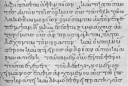
In Greek this went differently—the letter nu was reduced to a v shape, discarding the final2 stroke entirely. What we call Greek minuscule developed mostly independently (and arguably later); and in its earliest stages, the letters often join up on the midline, not only on the baseline as in Latin:
10th century. Doesn't actually have v-shaped nu letters in it yet, but the midline garlanding is very apparent.
That certainly gives us some insight into how a ductus transitions from unconnected to connected letterforms—strokes each have a sort of "priority" assigned to them for defining their contribution to the letter's identifiability, and the basic cursive forms are generated by removing the unimportant details and replacing them with garlands—semiotically meaningless motions of the pen that minimize the time required to commit all the important parts to the page. Recalling our previous near-death experience with Roman cursive, the internal monologue about what joints, loops, bowls and strokes of the letters take priority is very near the surface. Interestingly some of these shapes now look alien—particularly the backward letter for "B"—which underscores that different readers can look at the same shape and see different things.
It is fascinating to realise that even when forms are identical (i.e., Latin N and Greek Ν) and in the same alphabet (Roman B and Renaissance B) the interpretation of what defines the letter's shape and its meaning can still vary. It seems that despite having ostensibly isomorphic topologies, letters are not really isomorphic at all unless they're in the same context.
ASIDE—MAJUSCULE AND MINUSCULE. Astute observers have probably noticed that, of all the samples we've looked at so far, only those from the Renaissance and later contained clear examples of capital letters being used in the familiar manner, to mark out the starts of sentences and certain proper nouns. This is not an accident—mixed-case writing as we know it is a modern invention.
For most of history writing did not have this feature, and it only exists today in a handful of European scripts. Scribes would often use an older standard of handwriting for titles and embellished initial letters (what a modern typographer might call an "illuminated drop-cap"), but the modern marriage between Roman-derived capitals and Carolingian-derived minuscule forms happened by accident in the 14th or 15th century, when the early Italian humanists were in the middle of the throes of the Renaissance. They were already under the impression that dual-case writing was the norm, and mistook Carolingian for the lost lower case of the capitals that were carved on the ruins around them. (Although the Vatican Library contains uncial manuscripts dating back to the 4th century AD and earlier, it seems texts using the Carolingian script were the oldest the humanists could access at the time.)
The Fraktur capital "A" we looked at earlier was displaced, as a result, and with it nearly a thousand years of Blackletter hands in most of Europe, soon to be replaced by the printing press (which was initially used for Fraktur by Gutenberg but was almost ubiquitously used with humanist-inspired serif typefaces outside of Austria and Prussia.)
So. Key observations for this part:
1. Constructed scripts are sometimes designed using a top-down approach, where a large prototype shape is defined and pieces are derived from it, like a stencil. This was the basis for most of Tengwar. Using prototypes like this makes it easy to limit the stroke inventory, but it is unrealistic, and hard to read. (Tolkien's later prequel script, Sarati, uses the prototype shapes for a much smaller portion of its inventory, thus providing an evolutionary explanation for how this could have happened, but it's still a fundamentally bad approach.)
2. When prototype shapes do occur in natural scripts, it's generally either the result of an underlying consideration (medium restrictions or letter-box framing restrictions), and they are festooned with exceptions—nearly every letter has some extra adornment or stroke that makes it substantively unique.
3. A basic cursive script can be constructed by identifying distinguishing features (joints, bowls, loops, stems, strokes, whatever) for each letter or letter-pair, and replacing the rest with garlands (unimportant connecting strokes).
4. If letters have redundant (extra) distinguishing features, then the choice of which features get retained is arbitrary. Identical letterforms in ancient Latin and Greek alphabets gave way to different minuscule forms because of this: lower case n looks too much like η (eta) to be used in Greek, and ν (nu) looks too much like lower case v to be used in Latin.
5. Context is unavoidable when establishing which features are significant. Old Roman cursive has a shape for "B" that looks like "d" to a modern reader.
6. As scripts evolve, the important features of letters drift. This causes them to lose isomorphy (equivalence) with past forms. (The perfect examples, not covered in this piece, are Η -> И and Ν -> Н in Cyrillic.)
In the next part we'll look more closely at script evolution and iteration, specifically the issues of stroke contrast and the nightmarish parody of a script that is Germany's once-beloved Sütterlinschrift.
————
Footnotes
1 Bragging about Hangul is like bragging about sunshine. Don't.
2 The letter nu briefly passed through a phase that resembles μ, with the right foot removed. The modern form can therefore be described as missing both vertical strokes.
Comments
Anonymous:
Bummed that this post seems to be cut off; I love this series.
Sorry about that, I haven't actually written it yet! I'm glad it's well-received, though.