Last time, we looked at arm biomechanics and how physiology affects the ability of humans to produce shapes, especially straight lines, consistently. The prognostication was not exactly uplifting: we established that human muscles are naturally disposed to draw wobbly lines, and that extensive practice is required to draw a simple, straight horizontal line consistently without slowing down. But before we get into the marvels of how cursive writing avoids these problems, we ought to look at some of the strategies that various scripts developed to mitigate them prior to the invention of connected writing, as these approaches are still very much evident in all real-world continuous scripts. (And considering how bad the average person's handwriting is these days, you might even improve your natural-language legibility along the way...)


In all of these models, we are shown two things: first, how the strokes of the letters ought to relate to a frame around them, and second, the correct stroke order and stroke direction. Regardless of whether the source is five centuries old (as with Operina) or brand new (D'Nealian), effort is made to clearly communicate all three pieces of information. For the Latin hands, mention is made of the baseline, x-height, ascender height, and descender height, and in Katakana it is understood that the strokes relate to an enclosing box, like the Han logograms they ultimately derive from.
When widespread literacy first appeared in the Roman world among the upper classes, these techniques for keeping text neat and orderly were not brought with them. The Roman calligraphers who perfected the rustic and square capitals most certainly had these ideas down firmly:


These are both attractive, consistent calligraphic forms. A reader could easily derive a sense of what the model alphabet looks like just from looking at them. The same cannot be said for how Romans wrote on a daily basis; here is a model of Roman cursive:

Here is a "nice" specimen:

And here are some supposedly legible inscriptions from a wall inside one of the fanciest houses in Pompeii:

If you can decipher the word "EPAPHRODITUS" in the bottom left, that's about as far as most modern readers get. The text in the bottom right reads "CASTARDENYMPHA" (Casta arde nympha: "Burn, chaste nymph!")—the "L" and the giant diagonal "\" after it form a single "D"! Even with the above model at hand, this is a serious chore to decipher, and most of the graffiti in Pompeii is considerably harder to read.
Consider the present day. Think of someone you know with really ugly, terrible handwriting. (Perhaps yourself.) Have you ever watched them write? Do they consistently start their letters from the left side and favour clockwise strokes? Probably not. There's a strong connection between bad stroke order/direction and disorganized, chaotic writing. Much of that comes from the topic we covered in the last part of this series—how the arm muscles are inherently unstable and need to practice a uniform motion repeatedly to have any hope at fine motor control—but poor consistency is also invariably a result of failing (or struggling) to visualise how the finished letter will relate to the space it's supposed to inhabit. If you put your pen down to start drawing the downward stroke of the letter "x", and it doesn't start at the midline like it should, the whole letter will be messed up. If you draw an "o" counter-clockwise starting from the bottom-middle (which I have seen people do!) then you'll be consistently able to close the loop (as the stroke will end going southeast, which has some of the strongest control) but the top will be hard to line up with the midline, and the right side will probably be flat.
In the last image, there are some explicit clues that strokes were not always drawn in the same direction. In the middle of the image, where four diagonal lines cross, we have the word "QUISQUIS", drawn with the extremely dramatic "ʃ" shapes stereotypical of Roman cursive. These Ses show good curvature at the top, but flatten out into a diagonal line at the bottom as the writer exercised less control. By contrast, in the very top-right corner of the image, we can actually see an "ʃ" that was almost certainly drawn from bottom-to-top, at the end of the first line of the inscription "FELICEMSOMNUMQUITECUMNOCTEQUISCET"; the top of the ascender is flattened, perhaps dragged out, and is further away from the mass of the letter. The second line, "HOCEGOSIFACEREMULTOFELICIORESSE", seems to have downward-drawn Ses. In general, we can hypothesise that control over a stroke typically weakens over its length, especially if it is large or dramatic.
As for that ridiculous diagonal stroke in "CASTARDENYMPHA"... the gap between the "L" and "\" portions really is quite large. It's possible it was drawn as the descender on the "Q" in the above line (which reads "QUISQUISAMATALEAT"), and then incorporated into the second inscription below: then we can surmise that the poet wrote the left half of the bottom inscription without enough careful planning, which is a top-down design problem that actually has nothing to do with this article, but yikes, is it ever ugly.
As an aside, there are many other Roman cursive inscriptions that show a similar disdain for spacing; it's common to see things that look like "λλλλΤ" but are actually "AMAT". This is a universal problem with cursive scripts, however: Merovingian cursive, several centuries later, had Uncial-derived "A"s that looked like "cc", so that "aca" would become "ccccc". Relatedly, ambiguity between "u" and "n" was very prevalent in later medieval hands, and persists in modern handwriting; Sütterlin often looks like this when written quickly:

We'll look at this problem in more detail in parts three and four of this series.
So. Lessons:
1. Every well-developed script is a game of connect-the-dots with invisible dots. There is a correct direction and order for every stroke.
2. The direction and order define how to fit within a certain frame, whether that's a set of lines or a box with fixed proportions.
3. You have the most control over where your stroke starts, because if you don't like where your pen falls you can simply lift it up without inking anything.
4. Pulling toward the pen hand is easier to control than pushing away. Distortions in stroke shape make it clear when this is not done consistently, a mistake humans have been making for literally thousands of years.
5. Bad handwriting is often at least partly fixable by using standard stroke order and stroke direction.
Glyph Construction
Sütterlin, standard German handwriting method taught in the early 20th century
Japanese Katakana, showing stroke order
D'Nealian cursive, the standard English handwriting method taught in the late 20th century
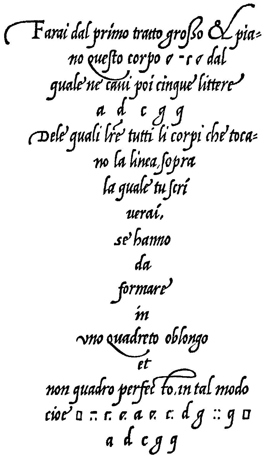
Ludovico Vicentino's Operina (1522) explains: From the first stroke, bold and short, make this letter-shape [...] on which these five letters, a d c g q, are based. The bodies of these letters, which sit on the baseline, should fit a condensed rectangle, not a perfect square, thus [...]
In all of these models, we are shown two things: first, how the strokes of the letters ought to relate to a frame around them, and second, the correct stroke order and stroke direction. Regardless of whether the source is five centuries old (as with Operina) or brand new (D'Nealian), effort is made to clearly communicate all three pieces of information. For the Latin hands, mention is made of the baseline, x-height, ascender height, and descender height, and in Katakana it is understood that the strokes relate to an enclosing box, like the Han logograms they ultimately derive from.
When widespread literacy first appeared in the Roman world among the upper classes, these techniques for keeping text neat and orderly were not brought with them. The Roman calligraphers who perfected the rustic and square capitals most certainly had these ideas down firmly:
Vergilius Romanus. Rustic capitals at bottom.
Vergilius Augusteus. Square capitals, the basis for Roman epigraphic (stone) inscriptions.
These are both attractive, consistent calligraphic forms. A reader could easily derive a sense of what the model alphabet looks like just from looking at them. The same cannot be said for how Romans wrote on a daily basis; here is a model of Roman cursive:
Possibly created in MS Paint.
Here is a "nice" specimen:
First century AD.
And here are some supposedly legible inscriptions from a wall inside one of the fanciest houses in Pompeii:
Also first century AD. From Benefiel, AJA 114 (2010) 59–101.
If you can decipher the word "EPAPHRODITUS" in the bottom left, that's about as far as most modern readers get. The text in the bottom right reads "CASTARDENYMPHA" (Casta arde nympha: "Burn, chaste nymph!")—the "L" and the giant diagonal "\" after it form a single "D"! Even with the above model at hand, this is a serious chore to decipher, and most of the graffiti in Pompeii is considerably harder to read.
Consider the present day. Think of someone you know with really ugly, terrible handwriting. (Perhaps yourself.) Have you ever watched them write? Do they consistently start their letters from the left side and favour clockwise strokes? Probably not. There's a strong connection between bad stroke order/direction and disorganized, chaotic writing. Much of that comes from the topic we covered in the last part of this series—how the arm muscles are inherently unstable and need to practice a uniform motion repeatedly to have any hope at fine motor control—but poor consistency is also invariably a result of failing (or struggling) to visualise how the finished letter will relate to the space it's supposed to inhabit. If you put your pen down to start drawing the downward stroke of the letter "x", and it doesn't start at the midline like it should, the whole letter will be messed up. If you draw an "o" counter-clockwise starting from the bottom-middle (which I have seen people do!) then you'll be consistently able to close the loop (as the stroke will end going southeast, which has some of the strongest control) but the top will be hard to line up with the midline, and the right side will probably be flat.
In the last image, there are some explicit clues that strokes were not always drawn in the same direction. In the middle of the image, where four diagonal lines cross, we have the word "QUISQUIS", drawn with the extremely dramatic "ʃ" shapes stereotypical of Roman cursive. These Ses show good curvature at the top, but flatten out into a diagonal line at the bottom as the writer exercised less control. By contrast, in the very top-right corner of the image, we can actually see an "ʃ" that was almost certainly drawn from bottom-to-top, at the end of the first line of the inscription "FELICEMSOMNUMQUITECUMNOCTEQUISCET"; the top of the ascender is flattened, perhaps dragged out, and is further away from the mass of the letter. The second line, "HOCEGOSIFACEREMULTOFELICIORESSE", seems to have downward-drawn Ses. In general, we can hypothesise that control over a stroke typically weakens over its length, especially if it is large or dramatic.
As for that ridiculous diagonal stroke in "CASTARDENYMPHA"... the gap between the "L" and "\" portions really is quite large. It's possible it was drawn as the descender on the "Q" in the above line (which reads "QUISQUISAMATALEAT"), and then incorporated into the second inscription below: then we can surmise that the poet wrote the left half of the bottom inscription without enough careful planning, which is a top-down design problem that actually has nothing to do with this article, but yikes, is it ever ugly.
As an aside, there are many other Roman cursive inscriptions that show a similar disdain for spacing; it's common to see things that look like "λλλλΤ" but are actually "AMAT". This is a universal problem with cursive scripts, however: Merovingian cursive, several centuries later, had Uncial-derived "A"s that looked like "cc", so that "aca" would become "ccccc". Relatedly, ambiguity between "u" and "n" was very prevalent in later medieval hands, and persists in modern handwriting; Sütterlin often looks like this when written quickly:
We'll look at this problem in more detail in parts three and four of this series.
So. Lessons:
1. Every well-developed script is a game of connect-the-dots with invisible dots. There is a correct direction and order for every stroke.
2. The direction and order define how to fit within a certain frame, whether that's a set of lines or a box with fixed proportions.
3. You have the most control over where your stroke starts, because if you don't like where your pen falls you can simply lift it up without inking anything.
4. Pulling toward the pen hand is easier to control than pushing away. Distortions in stroke shape make it clear when this is not done consistently, a mistake humans have been making for literally thousands of years.
5. Bad handwriting is often at least partly fixable by using standard stroke order and stroke direction.

